(7) comments
Add Your Reply

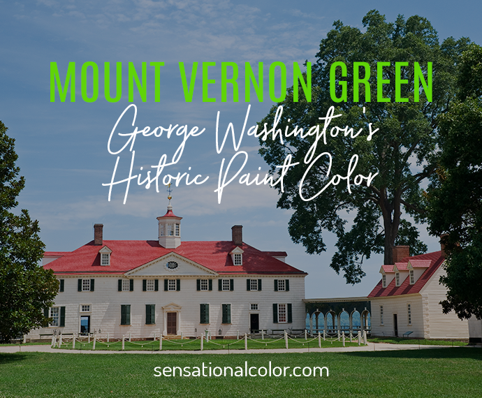
Originally published: 2005| Rewritten 06-13-25 – This story has been expanded with new insights about Mount Vernon Green and other colors in the palette, George Washington’s vision, and where you can find these historic paints today,
Mount Vernon is high on my fantasy list of dream homes. Not just for its stately architecture or panoramic views of the Potomac River, but for something more subtle yet deeply powerful: the colors.

The grounds at Mount Vernon are gorgeous and expansive. Keep in mind that in my dream life I can well afford to have someone else maintain the many acres of grass, flowers and trees.
In this imagined life, someone else is maintaining the acres of rolling lawn, formal gardens, and woodlands. But even in this dream, I’m fixated on the walls.

Mount Vernon is on the water with a spectacular water view! Thanks to having the foresight to buy the land across the river and turn it into a park, the home will always look across the river at greenery.
From the moment I first visited, I was struck by the intentional use of color throughout the mansion. George Washington didn’t just set out to impress—he selected hues that would elevate the experience of living. One color in particular captures that idea beautifully: Mount Vernon Green.
Mount Vernon Green is the deep, glazed verdigris shade Washington chose for the dining room in 1785 — one of the boldest interior colors of its era, and one still recreated today through Fine Paints of Europe’s Estate of Colours™ collection.
On a recent visit, my son and I took the National Treasure tour, which gave us behind-the-scenes insights into the filming of the movie and access to parts of the estate not typically open to the public. Walking along the riverbank below the house—a spot usually off-limits—felt like stepping into a secret world.
Afterward, we toured the mansion, and I was immediately drawn into the color story inside. Like many homes of the late 18th century, Mount Vernon features rooms painted in deep, bold colors. These saturated hues were expensive to produce at the time, making them a visible symbol of status. But what Washington chose went beyond fashion.
In the large dining room, he used a vivid verdigris green that was—and still is—arresting. This wasn’t just his favorite color: according to Mount Vernon’s own history of the room, Washington described the color as “grateful to the eye” and less likely than other paint colors to fade. Choosing a color for how it felt as much as how it looked? That’s the kind of thinking we now call color psychology.
To preserve and intensify the color, he had the paint glazed—a technique that added depth and sheen, and one that paint experts still use today to create richness and light reflection.
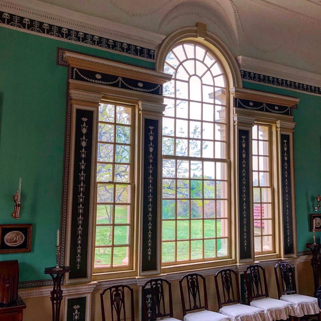
Appitecture, CC BY-SA 4.0 via Wikimedia Commons
In 2003, the Mount Vernon Ladies’ Association granted exclusive rights to reproduce the mansion’s historic colors to Duron Paints, a division of Sherwin-Williams. Later, Fine Paints of Europe took up the brush, launching the Estate of Colours™ collection.
This palette includes nearly 30 colors recreated with scientific precision from the original pigments used in the mansion, along with 90 additional shades inspired by Mount Vernon’s 500-acre plantation and period artifacts.
These paints are tailor-made for anyone who wants to live with history—and with beauty.
You can view and purchase the Mount Vernon colors (including Mount Vernon Green) through Fine Paints of Europe. Sample jars, fan decks, and full-size cans are available in both oil-based and waterborne finishes. If you’re weighing exterior colors for your own home, our guide to the longest-lasting exterior paint colors can help you pick a finish built to last.

Mount Vernon Green is the deep, verdigris-based paint color George Washington chose for the dining room at Mount Vernon in 1785. It’s glazed for extra depth and sheen, and it’s still recreated today in Fine Paints of Europe’s Estate of Colours™ collection.
In 1785. It remains one of the boldest, best-documented color choices Washington made anywhere in the house.
According to Mount Vernon’s own history of the room, Washington described the color as “grateful to the eye” and less likely than other colors to fade. He also had it glazed, a technique that deepened the color and made it more reflective.
Rich, saturated pigments were expensive to produce in the 18th century, so a color this bold signaled wealth and refinement as much as taste.
Yes. Fine Paints of Europe‘s Estate of Colours™ collection recreates it, along with roughly 30 other original Mount Vernon pigments, through forensic color-matching — available in sample jars, fan decks, and full-size cans.
Are you a fan of historic homes? Do any have paint colors that have inspired your own choices? I’d love to hear which period properties or color stories have captured your imagination. Leave a comment and share your favorites.
Or better yet—have you ever used a historic hue like Mount Vernon Green in your own home? Tag me or share your story. I’m always fascinated by how color connects us to the past, while still shaping how we live today.
